
More traffic is not always the answer to a quiet enquiry inbox. If suitable visitors already reach the site but do not act, buying more clicks can increase cost without repairing the customer journey. The first job is diagnosis.
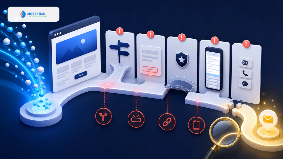
A conversion problem usually sits in one or more of four layers: the wrong people arrive, the offer is unclear, trust is insufficient or the action path creates friction. Measurement gaps can hide all four.
1. The traffic does not match the intent
A high-volume educational query may bring readers who want information, not a service. A broad social post may attract people outside the service area. An ad may match an ambiguous keyword. Segment traffic by source, landing page, location and query intent before judging the website as one audience.
2. The value proposition is vague
Visitors should quickly understand what the business does, who it helps and what makes the offer suitable. Abstract phrases about innovation or excellence create work for the reader. Specific language about the service, audience, location and outcome creates orientation.
3. The service is difficult to understand
A visitor may be interested but unable to identify what is included, what the process looks like or whether the business handles their situation. Service pages should explain scope, suitability, process, evidence, limitations and the next step without forcing a sales conversation for basic information.
4. The CTA is weak or mismatched
Generic buttons such as ‘Learn more’ hide the consequence of clicking. Aggressive ‘Buy now’ prompts can be too large a commitment for complex services. Use action language that matches readiness: view examples, check availability, request an assessment, book a consultation or send project details.
5. Trust is missing at the decision point
Logos and testimonials alone do not create trust. Customers look for consistent identity, clear contact details, real people, useful case evidence, policies, secure pages, reviews and realistic claims. Place relevant proof near the claim or action it supports.
6. Mobile experience creates friction
A form that feels reasonable on desktop may be difficult on a narrow screen. Sticky elements can cover controls, tap targets can be cramped and long text can bury the next step. Test at 390px and 320px widths with real content, not only design frames.
7. The form asks for too much
Every required field creates effort and privacy concern. Ask only for information needed to start the conversation. Explain what happens after submission, provide validation that helps rather than blames, and confirm success clearly. Offer an appropriate alternative such as phone or email where useful.
8. Contact paths are broken or inconsistent
Click-to-call links, WhatsApp destinations, booking calendars and form notifications can fail silently. Test the complete route, including the internal handoff. An enquiry delivered to an unmonitored mailbox is a conversion failure even if analytics records a successful submit.
9. Proof is generic
‘Great service’ says less than specific evidence about the problem, work and outcome. Case material should be truthful and appropriately detailed. If confidential data cannot be shared, explain the method, deliverables or anonymized pattern without inventing results.
10. Follow-up is too slow or unclear
The website journey continues after submission. Confirm receipt, state a realistic response window and route the enquiry to an owner. Record source and context so the person does not need to repeat everything.
11. Tracking measures the wrong success
Page views and sessions cannot show whether suitable prospects act. Define meaningful events: form success, qualified call, booking, message start, proposal and sale. Check that tags fire only when the action really occurs, and connect lead quality back to the source.
| Symptom | Likely issue | First check |
|---|---|---|
| High bounce on one landing page | Intent or message mismatch | Compare query/ad promise with the first screen |
| Many form starts, few completions | Form friction or error | Test fields, validation and mobile keyboard |
| Clicks on contact, few received leads | Broken handoff or tracking | Complete the journey on real devices |
| Many leads, low quality | Targeting or qualification mismatch | Review sources, queries and form context |
| Good leads, low sales | Offer, follow-up or sales process | Audit response time and conversation outcomes |
A disciplined conversion audit
- Define the qualified customer and desired action.
- Segment traffic by source, intent and landing page.
- Review the first screen for promise clarity.
- Check service scope, proof and objections.
- Test every CTA and form at desktop, 390px and 320px.
- Verify tracking against real received enquiries.
- Review lead quality with sales or the enquiry owner.
- Change one high-confidence issue and measure again.
The Website Growth Analyzer can provide a useful technical and conversion-readiness starting point. It should be combined with analytics, search query data, real device testing and enquiry-quality review.
Traffic is an input, not the objective
Start with evidence, not redesign opinions
A stakeholder may dislike the color of a button while the actual problem is irrelevant traffic. Another may demand a shorter form even though users abandon before reaching it. Combine quantitative and qualitative evidence: source and query data, page recordings where consent allows, form errors, customer questions, sales notes and real usability observation.
Review the first screen as a decision
The first screen should orient rather than explain everything. It needs a specific service or outcome, relevant audience context and a credible next step. If the business depends on location, eligibility or urgency, surface that information early. Remove rotating messages that force visitors to wait for the relevant promise.
Map objections to evidence
List the reasons suitable customers hesitate: uncertainty about fit, process, price approach, timing, privacy, support or outcomes. Match each objection with honest information. A process outline can reduce uncertainty; a relevant example can demonstrate capability; a policy can clarify risk. Do not answer an objection with a generic testimonial if the customer needs specific proof.
Form design is a conversation
Field order should feel natural. Use clear labels that remain visible, suitable input types, helpful error messages and an obvious success state. Explain optional versus required information. If the form qualifies complex work, separate essential first-contact details from information that can be gathered after a response.
Alternative contact paths need equal care
Some customers prefer phone or messaging, especially for urgent or local services. Others need email or a formal form. Offer only channels the team can manage. Pre-filled messages should provide context without forcing awkward text, and business hours or response expectations should be accurate.
Run controlled improvements
Prioritize changes by evidence, impact and effort. Fix broken tracking and delivery before debating copy variations. Change one meaningful hypothesis at a time where traffic permits, and record the before-and-after period. Small businesses may not have enough volume for formal experiments, so combine directional data with interviews and repeated patterns.
A conversion review meeting should ask
- Which sources produced suitable visitors?
- Where did the largest verified drop occur?
- Which objections appeared in real enquiries?
- Did tracked submissions reach the right owner?
- How quickly did the team respond?
- Which changes were made and what happened afterward?
- What should be tested next, and why?
A website earns its role when it helps the right person understand, trust and act. Diagnose the broken step before increasing acquisition. Often the most valuable growth work is not another campaign; it is making the existing journey coherent.
Key takeaways
What to remember
- More traffic can amplify conversion problems.
- Intent and proposition should be checked first.
- Trust, mobile usability and form design preserve intent.
- The internal enquiry handoff is part of conversion.
- Measurement must reconcile with real lead quality.
FAQ
Common questions
Why does my website get traffic but no enquiries?
Common causes include wrong traffic intent, unclear value, weak CTAs, insufficient proof, mobile friction, difficult forms, broken contact paths and incomplete measurement.
Should I buy more traffic if conversions are low?
Not before diagnosing the current journey. More traffic can increase cost without fixing intent mismatch or conversion friction.
What should a website conversion audit include?
Review source and intent, landing-page promise, service clarity, trust, CTAs, mobile usability, forms, contact delivery, follow-up and verified conversion tracking.
References
Sources and further reading
- Google Analytics: Understand Conversions (opens in a new tab)
Official event and conversion guidance.
- web.dev: Accessible Forms (opens in a new tab)
Google-supported form usability guidance.
Editorial trust
Digvertise Editorial Team
Digvertise Editorial TeamResearch-led practical guidance prepared by the Digvertise editorial team.
- Editorial date
- August 8, 2026