Every day, thousands of potential clients visit corporate websites looking for services. They search for a local manufacturer, a dental clinic, a CA firm, or a software partner. When they land on a website, they make a decision within three seconds: should I trust this company and get in touch, or should I click back and find a competitor? Unfortunately, most business websites are full of design errors that drive prospects away.
Your website is not just a digital brochure. It is the core of your customer acquisition system. If your website design fails to load quickly, hides your contact options, uses unreadable fonts, or makes the enquiry process difficult, you are wasting your marketing budget. Even the best search engine rankings or paid campaigns will not generate sales if your website is built with conversion-reducing design flaws.
At Digvertise, we look at website design through a practical, outcomes-oriented lens. We don't build websites just to look artistic. We build digital conversion systems. By identifying and fixing basic layout and structural errors, you can turn your website from a passive cost center into a reliable lead generation engine.
Many business owners assume they need more traffic or higher advertising budgets to grow. In reality, they often need to fix their website's conversion flow. When you optimize your page layouts for the visitor, you get far more value from your existing traffic. This guide explains how to identify and resolve these common design mistakes.
What Conversion-Focused Website Design Actually Means
Conversion-focused website design is the process of structuring your digital layouts to guide visitors toward taking a specific action - such as submitting a contact form, calling your team, or booking a consultation. It balances visual aesthetics with technical performance and user psychology.
For example, when a prospect runs a scan using our Online Business Score tool, they receive their results in a clean, high-contrast interface. The page layout is simple, the text is easy to read, and the next step is clearly visible. This clear design is what drives conversion. It removes friction and makes taking action simple.
Why Slow Page Loading Speed is a Critical Mistake
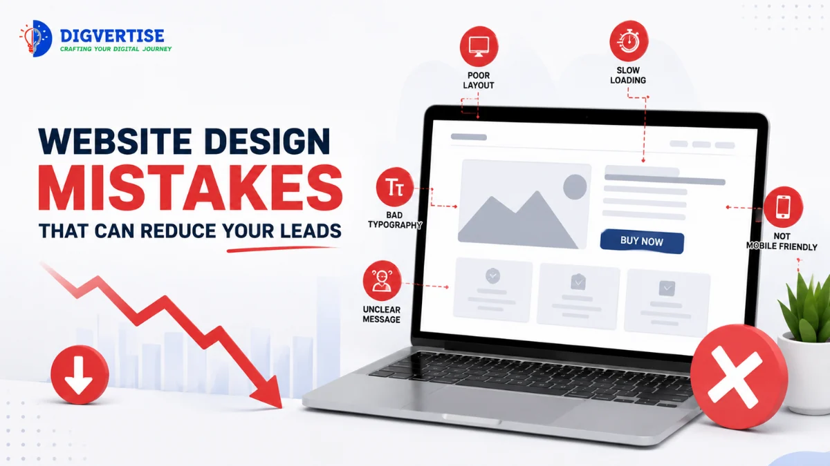
The most common website design mistake is slow page loading speed. If your website takes over three seconds to load, you will lose more than half of your mobile visitors. Slow page speeds are often caused by heavy unoptimized images, bloated code scripts, and lack of browser caching settings.
Google also considers page experience and performance signals. A slow website creates a poor experience and can weaken organic visibility. The Website Growth Analyzer helps business owners identify performance bottlenecks before they lose valuable enquiries.
The Digvertise Conversion Architecture™
To help service providers and B2B manufacturers build high-converting websites, we developed the proprietary Digvertise Conversion Architecture™. This framework outlines a 5-phase path to digital conversion dominance:
Phase 1 - Proactive Speed Diagnostic: Audit website load speeds across mobile viewports. Compress heavy images, remove unused code scripts, and implement page caching to keep load times under 3 seconds.
Phase 2 - Visual Command Focus: Design clean header layouts. Place a single, high-contrast Call-to-Action (CTA) button in the upper right corner and center of the hero section above the fold.
Phase 3 - Conversational Form Structuring: Simplify all contact forms. Limit initial fields to four inputs (Name, Email, Phone, and Message) and implement real-time validation to catch input errors immediately.
Phase 4 - Social Proof Integration: Embed verified client reviews, case studies, and trust badges near your contact forms. Link your pages to active profiles as described in our Google Business Profile Optimization guide.
Phase 5 - Automated Lead Handoff: Connect forms directly to your CRM using Growth Automation Services. Ensure that when a lead signs up, they receive an automated WhatsApp confirmation instantly.
High-Bouncing Website vs High-Converting Website: A Comparison
To help you evaluate your website design, let's compare the characteristics of a high-bouncing website versus a high-converting website:
FeatureHigh-Bouncing Website (Legacy Design)High-Converting Website (DCRP standard)Loading SpeedTakes over 5 seconds to load on mobile viewportsLoads in under 3 seconds (validated Core Web Vitals)CTA Button DesignLow-contrast text link hidden at the bottom of the pageHigh-contrast, prominent buttons placed above the foldContact FormsLong, complex forms asking for 8 to 10 detailed inputsSimple contact forms asking for 4 essential inputsMobile ExperienceText overlaps, images are cropped, horizontal scrollbarsResponsive fluid layouts built for standard mobile viewportsTrust VerificationNo reviews, case studies, or certifications displayedGeotagged testimonials and verified review scores displayed
Core Pillars of Website Conversion
If you want to resolve lead-reducing errors, focus on these three core pillars first:
Pillar 1: Above-the-Fold Visual Command: When prospects land on your website, they must immediately understand what you do, who you serve, and how to take the next step. Keep the background clean, use high-contrast headers, and place a prominent CTA button (like 'Get a Free Audit') above the fold.
Pillar 2: Mobile Viewport Optimization: Over 60% of search traffic comes from mobile screens. Your menus must be easy to navigate, your phone numbers must be clickable links, and your forms must be easy to fill with one thumb. Avoid using complex animations or heavy pop-ups that slow down mobile performance.
Pillar 3: Simple Lead Forms with Validation: Keep contact forms short. Asking for too much information upfront reduces conversions. Implement real-time field validation to catch typing errors instantly, preventing invalid data from cluttering your CRM database.
Automation should never replace relationships. It should remove repetitive work so your team can spend more time with customers. Set up automated confirmation messages so that when an ad click lead is captured, your consultants are notified instantly.
Common Website Design Mistakes to Avoid
Avoid these common mistakes to protect your business lead flow:
Hiding contact details: Forgetting to place your phone number and email address in a visible header or footer.
Using low-contrast button text: Designing buttons that blend into the background, making it hard for users to find where to click.
Cross-check NAP consistency across Google Maps, social media, and local search trust coverage.
Neglecting typography readability: Selecting tiny font sizes or low-contrast text colors that cause eye strain on mobile devices.
Ignoring website speed parameters: Adding large, uncompressed image files and heavy video scripts that cause long loading times.
Illustrative Example
Illustrative Example - not a real client
Consider a precision parts manufacturer in Pune. The factory had an impressive facility and excellent machinery, but their website was built with heavy Flash animations, large uncompressed PDF brochures, and a contact form containing 12 fields (including GST details and company registration numbers). The website loaded in 8 seconds and was completely unreadable on mobile phones.
They restructured their website using the Digvertise Conversion Architecture™ framework. First, they removed all legacy flash animations, compressed their product photos, and set up a mobile-responsive layout using clean Google Fonts. They placed a high-contrast 'Request a Quote' button in the header and simplified their contact form to four fields.
They also added three case studies showing how they resolved specific parts issues for clients, complete with high-resolution photo galleries. Within three months of relaunching the optimized layout, their website conversion rate increased significantly, generating high-quality B2B export enquiries without changing their marketing budget, showing the power of conversion architecture.
Actionable Website Optimization Checklist
- Use this checklist to fix conversion errors on your website:
- Test Loading Speed: Verify mobile loading speed scores are over 80.
- Audit Header CTA: Place a high-contrast booking button in the upper right header.
- Check Mobile Layouts: Ensure there are no horizontal scrollbars on mobile viewports.
- Simplify Form Fields: Reduce initial contact form questions to four inputs.
- Enable Click-to-Call: Verify all telephone numbers are clickable links.
- Add Testimonials: Display real client reviews near your primary lead forms.
- Verify Font Hierarchy: Limit typography to two clean, professional font styles.
- Setup Auto-responders: Connect lead forms to automated WhatsApp or email replies.
- Audit Image Formats: Verify all graphics use modern, web-optimized extensions.
Conclusion
Most businesses don't need complicated visual setups. They need clarity. The first step is understanding where your website speeds slow down, where forms confuse visitors, and where layout clutter blocks conversions. Upgrading your conversion architecture is the foundation of online sales growth.
Key takeaways
What to remember
- Every day, thousands of potential clients visit corporate websites looking for services. They search for a local manufacturer, a dental clinic, a CA firm, or a software partner. When they land on a website, they make a decision within three seconds: should I trust this company and get in touch, or should I click back and find a competitor? Unfortunately, most business websites are full of design errors that drive prospects away.
- Your website is not just a digital brochure. It is the core of your customer acquisition system. If your website design fails to load quickly, hides your contact options, uses unreadable fonts, or makes the enquiry process difficult, you are wasting your marketing budget. Even the best search engine rankings or paid campaigns will not generate sales if your website is built with conversion-reducing design flaws.
- At Digvertise, we look at website design through a practical, outcomes-oriented lens. We don't build websites just to look artistic. We build digital conversion systems. By identifying and fixing basic layout and structural errors, you can turn your website from a passive cost center into a reliable lead generation engine.
FAQ
Common questions
Why does website loading speed affect lead generation?
Website loading speed shapes the first impression. If a page takes too long to load, visitors may leave before seeing the offer. Use the Website Growth Analyzer to review performance and mobile experience.
How many form fields should a high-converting website have?
Keep forms as short as possible. For initial contact forms, limit inputs to four essential details: Name, Email, Phone, and a short Message. Asking for extra details - like company revenue or budget ranges - reduces your form completion rates. Capture additional data later during the call.
What is mobile responsiveness, and why is it mandatory?
Mobile responsiveness means your website layout automatically scales, rearranges, and fits any screen size - from large desktop monitors to small smartphone viewports. Since over 60% of search traffic comes from mobile screens, a responsive page is mandatory to ensure text remains legible and buttons remain easy to tap.
How do I design CTA buttons that convert?
CTA buttons must stand out visually. Use high-contrast colors (e.g., using complementary tones that contrast with your main brand colors), leave generous white space around the button, and use clear, action-focused text like 'Get a Free Audit' instead of vague text like 'Submit'.
Should I display client reviews on my website?
Yes. Positive reviews are the strongest social proof. Displaying real testimonials, client logos, or linking to your verified review profiles builds instant trust. Learn more about review strategies in our [Local SEO Services](/services/local-seo/) audit.
How does website design link with Google Ads?
They are highly connected. If you spend budget on paid campaigns but send visitors to a slow, unoptimized landing page, they will bounce before converting, wasting your advertising budget. Check your landing page configurations using our [Google Ads Services](/services/google-ads/) guide.
What is a favicon, and why is it important?
A favicon is the small icon that appears in the browser tab next to your website title. Adding a custom, high-resolution favicon helps users find your tab easily when they have multiple pages open, which supports brand recognition.
Can growth automation work for businesses with fewer than five employees?
Yes. Small businesses benefit the most because automation reduces repetitive administrative work. It ensures that every lead captured from your website is routed to your team instantly, keeping your response times fast without hiring extra staff.
Editorial trust
Digvertise Team
Digvertise editorial teamPractical digital marketing guidance prepared by the Digvertise Team.
- Published
- March 11, 2026