Every morning, your prospects are bombarded with logos, advertisements, and marketing campaigns. They open their phones and see twenty different brands offering the same services. They search for a chartered accountant, a dental clinic, a jeweller, or a manufacturer. In this crowded digital environment, your brand identity is the single most powerful tool you have to stand out.
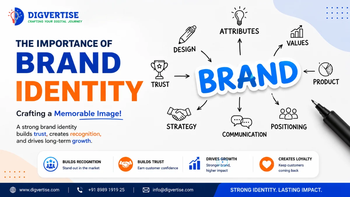
Brand identity is not just about designing a logo or choosing a color scheme. It is the visual, verbal, and emotional footprint of your business. It is the promise of quality you make to your clients and the systems you use to deliver on that promise. A weak identity causes confusion, while a premium identity builds instant trust, turning cold prospects into loyal clients.
At Digvertise, we look at branding through a practical, growth-focused lens. We don't believe in abstract art. We believe in design systems that align with your business services, improve page readability, and increase conversions. When your visual style, copywriting, and layout structures are unified, your customer acquisition costs decrease, and your marketing becomes more effective.
Many business owners assume they need more staff or massive advertising budgets to scale. In reality, they often need a better, more cohesive brand presentation. This guide explains how to build a brand identity that drives growth.
What Brand Identity Actually Means
Brand identity is the collection of all visual and verbal elements that a business creates to project the right image to its audience. It includes your logo design, typography choices, color palettes, copywriting voice, imagery rules, and website user interface.
For example, when a prospect runs a scan using our Online Business Score tool, they receive a clean, structured report. The font hierarchy, color coding, and simple layout of the report tell the user that Digvertise is structured, detail-oriented, and highly professional. That visual experience is brand identity in action.
Why Weak Brand Identity Blocks Conversion
Most growing businesses ignore brand consistency. They have one logo on their signage, a slightly different font on their website, an outdated layout on their social media profiles, and different templates for their client proposals. This disjointed presentation triggers subtle warning signs in a prospect's mind.
If your brand looks unprofessional or outdated online, clients assume your services will be similarly unoptimized. They skip your forms and call a competitor whose digital footprint feels premium and unified. Growth rarely slows because of lack of demand. It usually slows because trust is lost at the first point of contact.
The Digvertise Brand Trust Framework™
To help service businesses and manufacturers build premium brand authority, we developed the proprietary Digvertise Brand Trust Framework™. This framework outlines a 5-level path to brand dominance:
- Level 1 - Visual Styling Foundation: Establish a unified design system. Select two primary fonts (e.g., Outfit and Inter) and three HSL-tailored colors that match your industry's tone.
- Level 2 - Core Voice Optimization: Define your communication voice. Write copywriting guidelines that ensure your website, emails, and brochures use the same warm, professional tone.
- Level 3 - Footprint Synchronization: Sync your brand elements across all directories (like Google Maps), social media cover images, and company profiles. Learn more in our Google Business Profile Optimization guide.
- Level 4 - UI and CTA Alignment: Design clean, high-contrast layouts, then use the Website Growth Analyzer to review typography, button clarity, and mobile usability.
- Level 5 - Authority Integration: Integrate verified reviews, client video case studies, and industry certifications into your primary landing pages using Growth Automation Services.
Legacy Brand Presentation vs Modern Brand Identity: A Comparison
To help you evaluate your brand status, let's compare legacy brand presentation versus a modern brand identity system:
FeatureLegacy Brand PresentationModern Brand Identity (DCRP standard)Logo and AssetsCluttered, complex shapes that break on mobile viewportsScalable, responsive vector formats built for digital screensTypographyMultiple random system fonts used across different pagesConsistent Google Fonts (like Inter) with defined heading hierarchyColor StrategyGeneric colors (plain red/blue) with no digital color codesCurated, high-contrast HSL color system optimized for readabilityLayout and SpacingText-heavy paragraphs with no white space or marginsClean, fluid layouts with generous spacing and high-contrast marginsClient ConfidenceLow trust (looks like a small, unorganized operation)High trust (reflects stability, quality, and attention to detail)
Core Pillars of Brand Identity
If you want to upgrade your brand presence, focus on these three core pillars first:
Pillar 1: Scalable Visual System: Your visual assets must be built for digital screens. This means your logo must be clear even as a tiny browser tab icon (favicon). Select typography that remains readable on small mobile viewports, and color palettes that stand out against dark mode settings.
Pillar 2: Consistent Communication Voice: Define how your brand speaks. If your business solves complex financial problems, your copy should be clear, detailed, and reassuring. Avoid using generic marketing slogans or AI clichés. Speak like a trusted advisor.
Pillar 3: Landing Page Layout Consistency: When customers click on your ads, they expect to see the same colors, fonts, and message they saw in the ad. Maintaining consistency between your Google Ads Services landing pages and social media graphics doubles your campaign conversion rates.
Automation should never replace relationships. It should remove repetitive work so your team can spend more time with customers. Set up automated email templates that carry your signature brand fonts and color blocks.
Common Brand Identity Mistakes to Avoid
Avoid these common errors to protect your brand reputation:
Using too many fonts and colors: Cluttering your website with five different fonts and a mix of random colors, which makes your business look unorganized.
Ignoring mobile readability: Designing complex layouts with small text sizes or buttons that overlap on mobile viewports, making navigation difficult.
Cross-check NAP consistency across Google Maps, social media, and local search trust coverage.
Chasing visual trends blindly: Redesigning your logo or colors every year to follow design trends, which destroys brand recognition.
Neglecting technical page performance: Building a highly visual website with heavy files and large images that cause long loading times, causing visitors to bounce.
Illustrative Example
Illustrative Example - not a real client
Consider a Chartered Accountant (CA) firm in Pune. The firm had excellent tax expertise, but their website was built in 2012, using old system fonts, a low-resolution logo, and long paragraphs of tax regulations. They noticed that although they got client referrals, younger founders rarely booked consultations from their website.
The firm redesigned their brand identity using the Digvertise framework. They selected a clean typography hierarchy using Inter, a professional color system of deep navy blue and soft warm gray, and rewrote their service descriptions in clear business language.
They added client reviews, structured FAQ tables, and simplified their consultation booking forms. Within three months of launching their updated brand identity, the firm saw a significant increase in booking conversions from startup founders, showing that a premium, clean brand design builds immediate credibility with modern clients.
Actionable Brand Audit Checklist
- Use this checklist to evaluate and align your brand identity:
- Check Logo Scalability: Verify that your logo is clear and legible on mobile screens.
- Review Font Hierarchies: Limit your typography to two clean, professional font families.
- Confirm HSL Color Codes: Standardize your brand colors across all digital assets.
- Audit Mobile Layouts: Ensure text sizes are readable without zooming.
- Sync Directory Profiles: Update identical logos and descriptions on Google Maps.
- Standardize Client Proposals: Create unified document templates for all bids.
- Verify Email Signatures: Provide matching corporate signatures for all team members.
- Test Page Loading Speed: Ensure your website loads in under three seconds.
- Integrate Trust Signals: Display reviews and certifications on your homepage.
Conclusion
Most businesses don't need complicated visual setups. They need clarity. The first step is understanding where your brand presentation looks inconsistent, where layouts confuse visitors, and where unoptimized copy blocks conversion. Upgrading your visual system is the foundation of digital credibility.
Key takeaways
What to remember
- Every morning, your prospects are bombarded with logos, advertisements, and marketing campaigns. They open their phones and see twenty different brands offering the same services. They search for a chartered accountant, a dental clinic, a jeweller, or a manufacturer. In this crowded digital environment, your brand identity is the single most powerful tool you have to stand out.
- Brand identity is not just about designing a logo or choosing a color scheme. It is the visual, verbal, and emotional footprint of your business. It is the promise of quality you make to your clients and the systems you use to deliver on that promise. A weak identity causes confusion, while a premium identity builds instant trust, turning cold prospects into loyal clients.
- At Digvertise, we look at branding through a practical, growth-focused lens. We don't believe in abstract art. We believe in design systems that align with your business services, improve page readability, and increase conversions. When your visual style, copywriting, and layout structures are unified, your customer acquisition costs decrease, and your marketing becomes more effective.
FAQ
Common questions
What is the difference between a logo and a brand identity?
A logo is a single graphic mark or symbol that represents your business. A brand identity is the complete visual, verbal, and layout system that defines how your company looks, speaks, and feels across all digital platforms. Your brand identity includes your logo, typography, colors, copy style, and website design system.
How do I choose the right typography for my website?
Choose typography that is clean and highly readable. For digital platforms, sans-serif fonts like Inter, Outfit, or Roboto are highly recommended. Avoid using decorative or handwritten fonts for body copy, as they are difficult to read on small mobile screens. Set clear sizes for headings and paragraphs.
Does a professional brand identity help local search rankings?
Yes, indirectly. A clean, structured brand identity improves user metrics - like reducing bounce rates and increasing average session duration. Google's algorithms analyze these engagement signals to determine ranking authority. Learn more about this in our [Local SEO Services](/services/local-seo/) audit.
How do I define our brand's voice and tone?
Define your brand's voice by analyzing your target customers. If you are a CA firm, your tone should be professional, clear, and reassuring. If you are a hotel, your tone should be warm, inviting, and descriptive. Write clear copywriting rules to ensure consistency.
Should we update our logo to look modern?
Only if your current logo is difficult to read on mobile viewports or looks extremely outdated. When updating your logo, focus on simplicity and scalability. Avoid complex textures or detailed gradients that break when scaled down to favicon sizes. Keep the transition subtle.
How does branding link with paid search?
Branding is critical for paid search conversion. When users click on your ads, landing on a clean, brand-aligned page increases Quality Scores and conversions. Check your landing pages using our [Google Ads Services](/services/google-ads/) guide.
How often should a business refresh its brand identity?
Avoid frequent rebranding, as it confuses customers and reduces recognition. A professional brand system should last five to ten years. You can make minor optimizations - like improving typography readability or layout contrast - every few years without changing your core brand assets.
Can growth automation work for businesses with fewer than five employees?
Yes. Small businesses benefit the most because automation reduces repetitive administrative work. It allows a small team to handle a high volume of enquiries while maintaining a professional, consistent customer experience.
Editorial trust
Digvertise Team
Digvertise editorial teamPractical digital marketing guidance prepared by the Digvertise Team.
- Published
- February 9, 2026